By Lindsey Gates
Living in the fan district of Richmond, Virginia, I love to go on walks with my husband and son. This area is also referred to as “The Fan,” because the streets extend east to west in a fan shape. The Fan is home to many Richmond residents, houses of worship, restaurants, shops, parks, and schools. Every time I go out in my neighborhood, I travel a different route and always see something different. I have such an appreciation for the vast array of architecture and landscape in the fan. Today, I was particularly focused on gates. So many homes and churches are adorned with gates. Everything from wrought iron, some with intricate designs and others rather simple, to painted brick and wood. Gates add a certain kind of charm and privacy. I snapped some photos of the gates I was drawn to most.
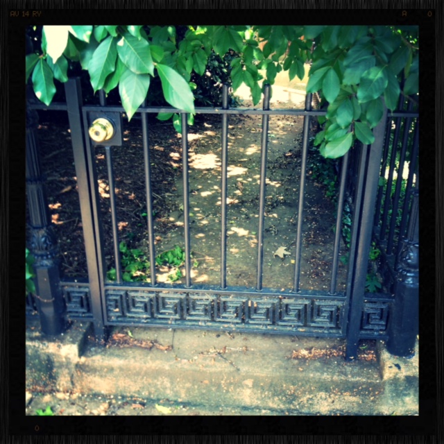
Traditional and simplistic. I really like the subtle Greek key border.
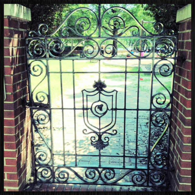
The beautiful Italian scrolls and crest design make for a grand entrance into a fan park.
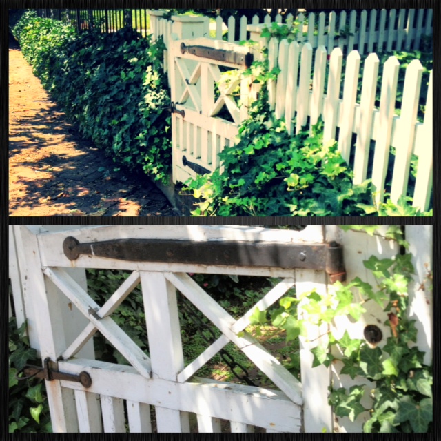
Ivy dresses up this white picket gate and fence. Love the rustic charm!
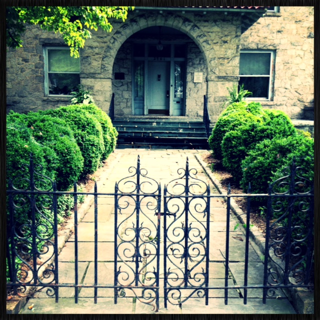
Great combination of Gothic spearheads and scrolls.
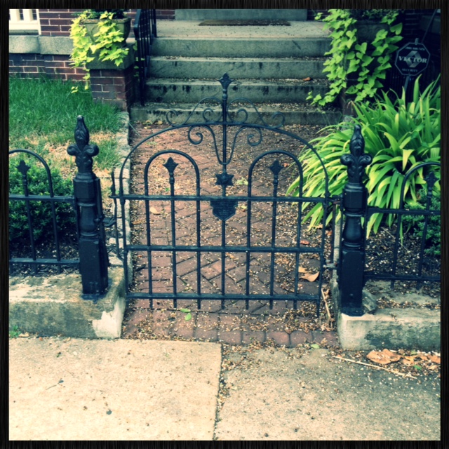
Baby gate!
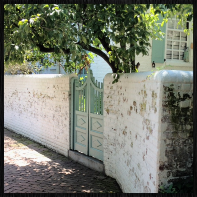
My absolute fav! Love the pale blue double door and weathered white brick. I don’t think we’re in the fan anymore Toto!

These tall grandiose white pillars add richness to this gate.
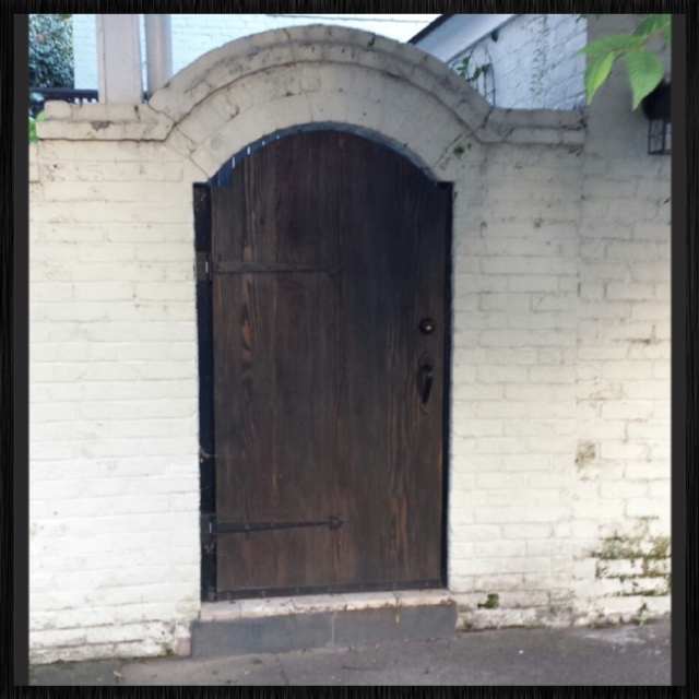
Nice contrast between the dark stained wood and painted white brick.
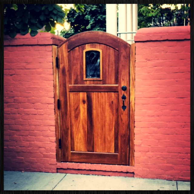
Clean cut wood gate paired with a coral brick wall.
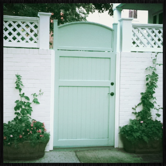
How inviting! Lovely greenery welcomes you to this side gate.
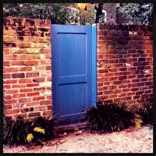
Walking through an alley way, I found this hidden gem! Love the vibrant color here.
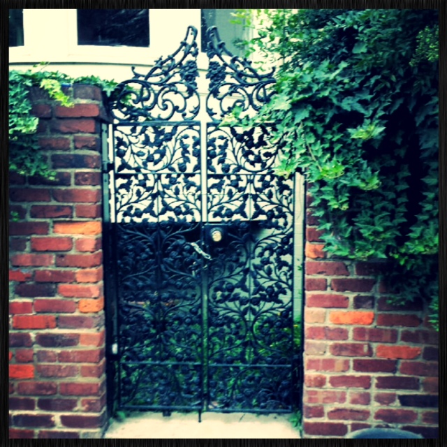
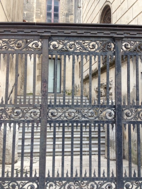
The sophisticated design in this wrought iron gate is so elegant and alluring to passers by.
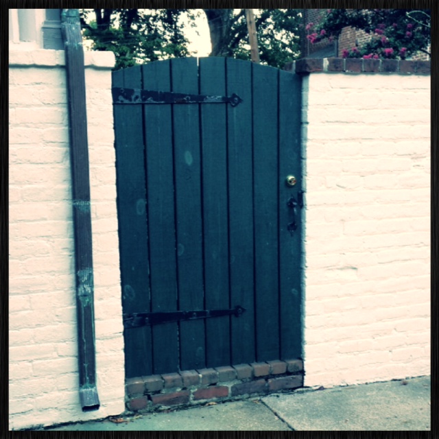
There is something delightful about this gate…
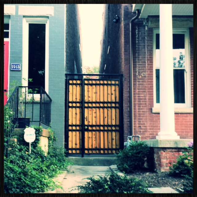
A more modern looking gate used in between two row houses.
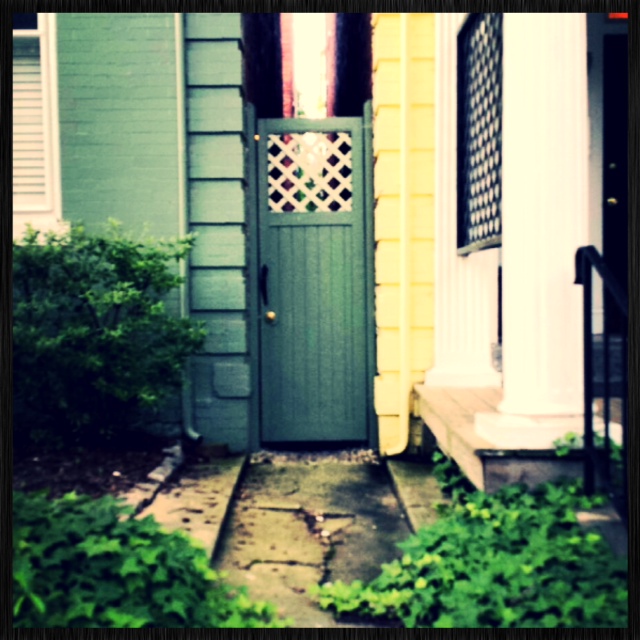
Tall and skinny.
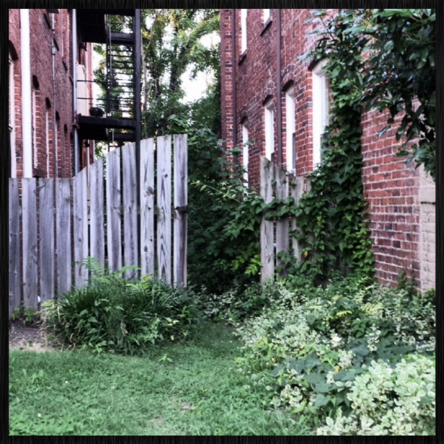
Something about this gate caught my eye. Very plain and worn looking, yet intriguing.
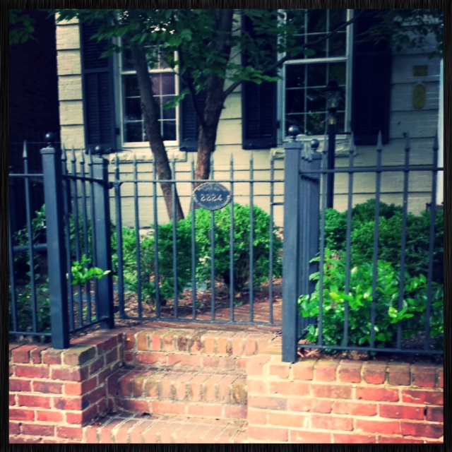
Clean lines, spearheads, and pedestal balls complete this gate and fence.
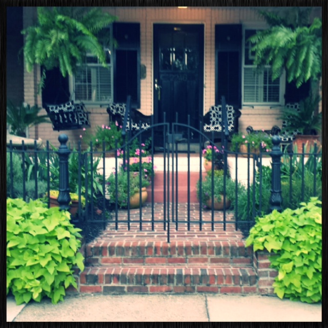
Great symmetry and balance here.
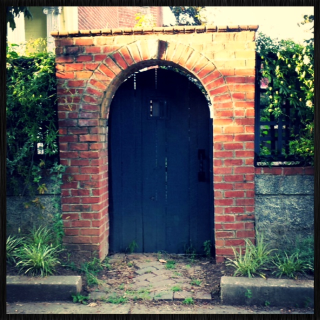
This gate looks like something out of a fairytale! What a beautiful brick archway.
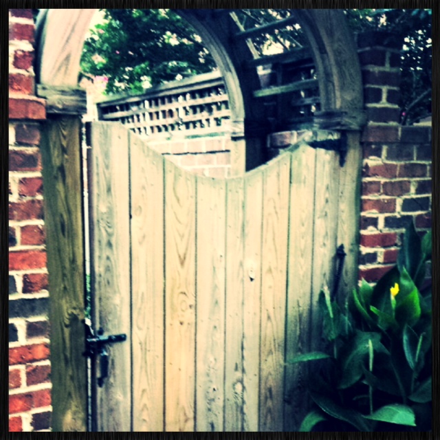
Sweet and innocent!
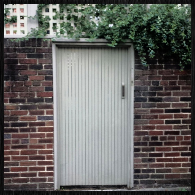
Rather plain, yet pleasant.
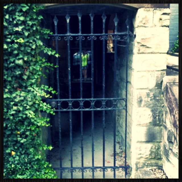
This gate is an entryway into a basement home.
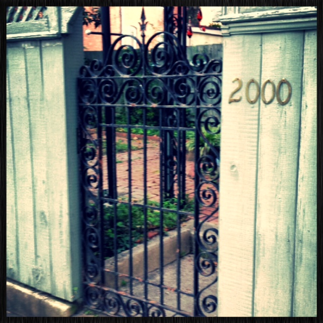
Rusted scrolls, painted wood, and lattice work make up this eclectic gate.
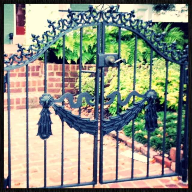
This double gate provides a warm welcome.
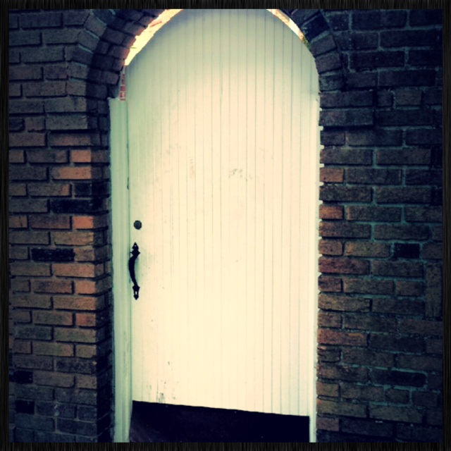
This arched door looks effortless paired with brick.
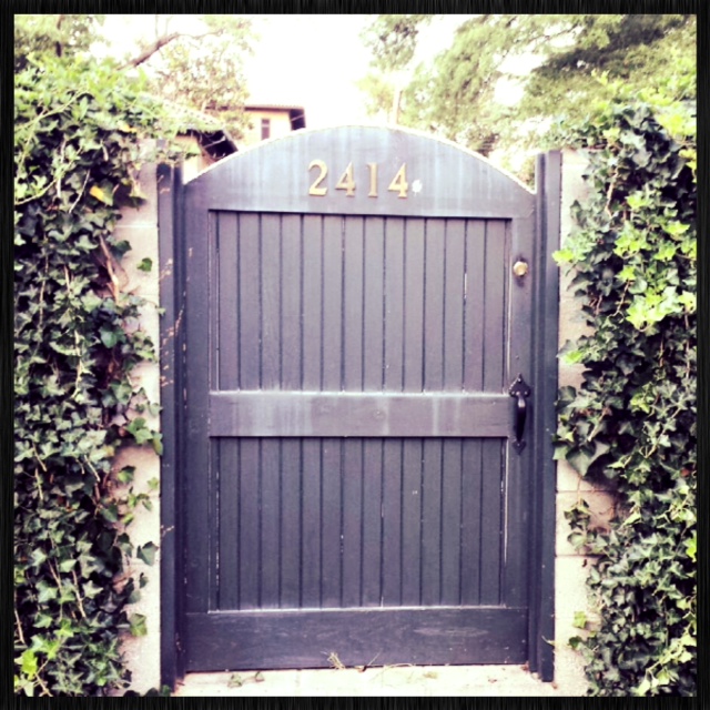
So clever to add your house number to a side gate!
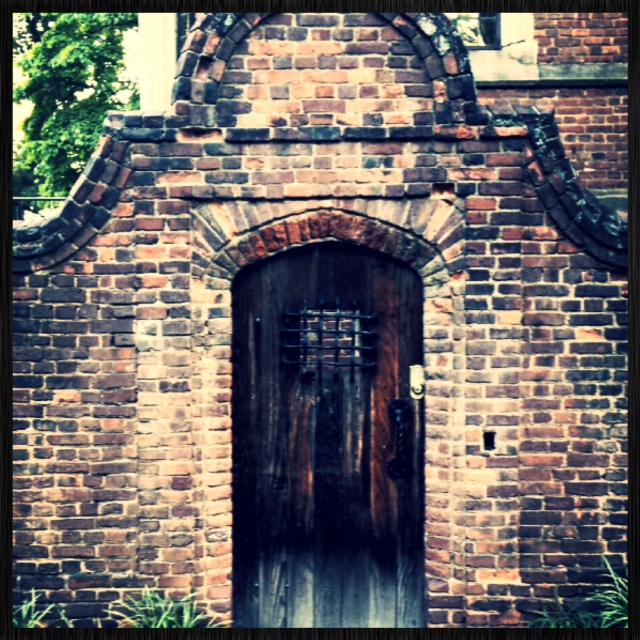
Exquisite brickwork and handsome wood door with a touch of wrought iron.
So many different designs. Each unique and wonderful in their own way. Oh the possibilities!
Leave a commentBy Sarah Wise, Intern at Turn Key Interiors
I’ve wanted to be an interior designer since I was about 12 years old. Growing up, I became obsessed with watching HGTV and tearing apart design magazines, and I thought I knew pretty much everything there was to know about being an interior designer. If I had a good eye for design, how much harder could it be? I’d also dreamed of going to Virginia Tech pretty much since birth, so there wasn’t really any other option in my mind. When I found out that Virginia Tech’s Interior Design program was in the top 10 in the nation, I knew that I was meant to be there, and today that’s exactly where I am.
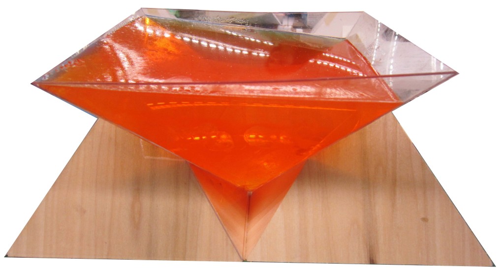
As the first day of studio neared, I thought I had an idea of how it would be: some drawing, maybe some color theory or studying famous designers. I was totally unaware of what design school would actually be like. Our first assignment had no further instructions than to “create order using points.” I was confused beyond belief and scared to death of doing something stupid or getting it completely wrong. It took me almost my entire first year to realize that doing things differently from everyone else was proof of a unique, creative mind and would almost always be praised rather than criticized. During that first year, we didn’t do much actual design, it was more of a thought-conditioning process to get us to think out of the box. Ironically, we made A LOT of boxes! I learned how to work with wood, wire, plastic, concrete, plaster, and I even made a project out of Jell-O (which proved extremely difficult in my dorm’s mini fridge and using this upside-down pyramid form). After that foundation year, my views on design and the way I looked at the world had changed completely.
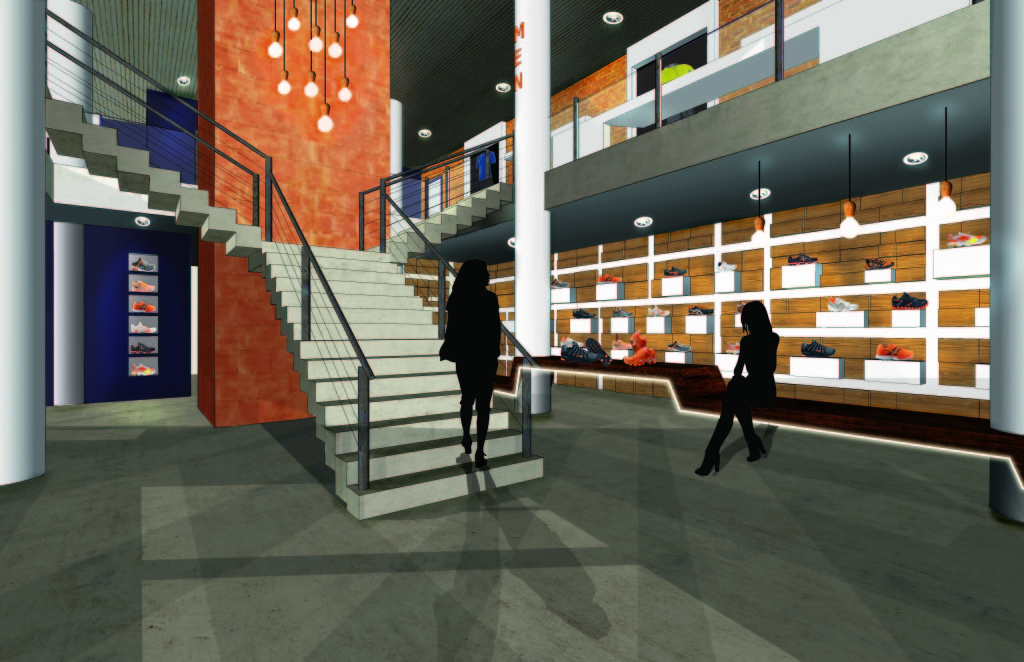
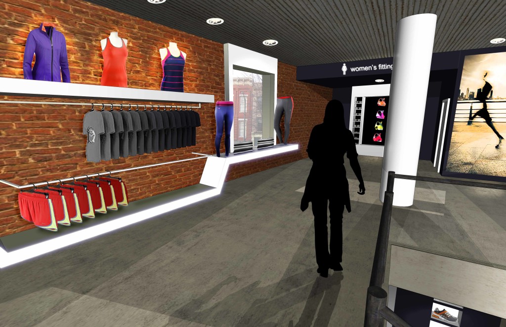
This past year was much more focused on interior design and made my dream to become a designer even stronger. Our first official project was to design a small sporting apparel store in an urban setting. I immediately had a vision for an energetic retail environment with an industrial urban feel from exposed brick, metal, and concrete. I came up with a zig-zag form that I used in several places, which abstractly mimicked the way a runner would move through a city, dodging pedestrians and possibly jumping over objects in his path. I also used a city grid pattern as the base for the shoe display wall, which was probably my favorite aspect of the design. By the end of the project I was so sick of it, but I still loved it and was pretty proud of what I’d accomplished. Apparently our studio sponsor liked it too, because they chose it as the winning design!
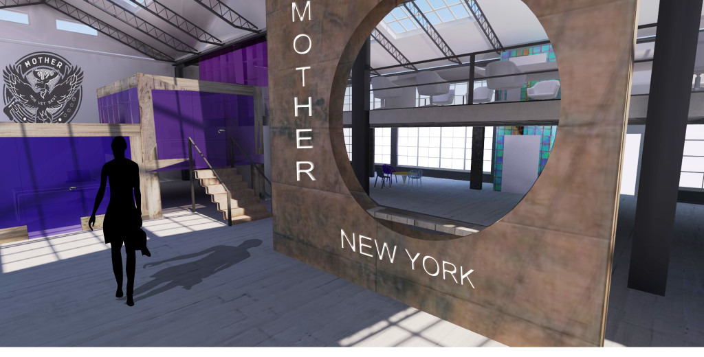
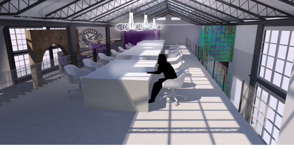
Spring semester of this year, we worked on two office interiors. The first was for an advertising agency in Brooklyn, NY, who wanted a playful office environment. My design was based on a stair-step concept. The three main partners’ offices were three stepped boxes, and the associates’ workspace was a single long table that had 3 different levels to accommodate for whether people preferred to work at table height, bar height, or in between.
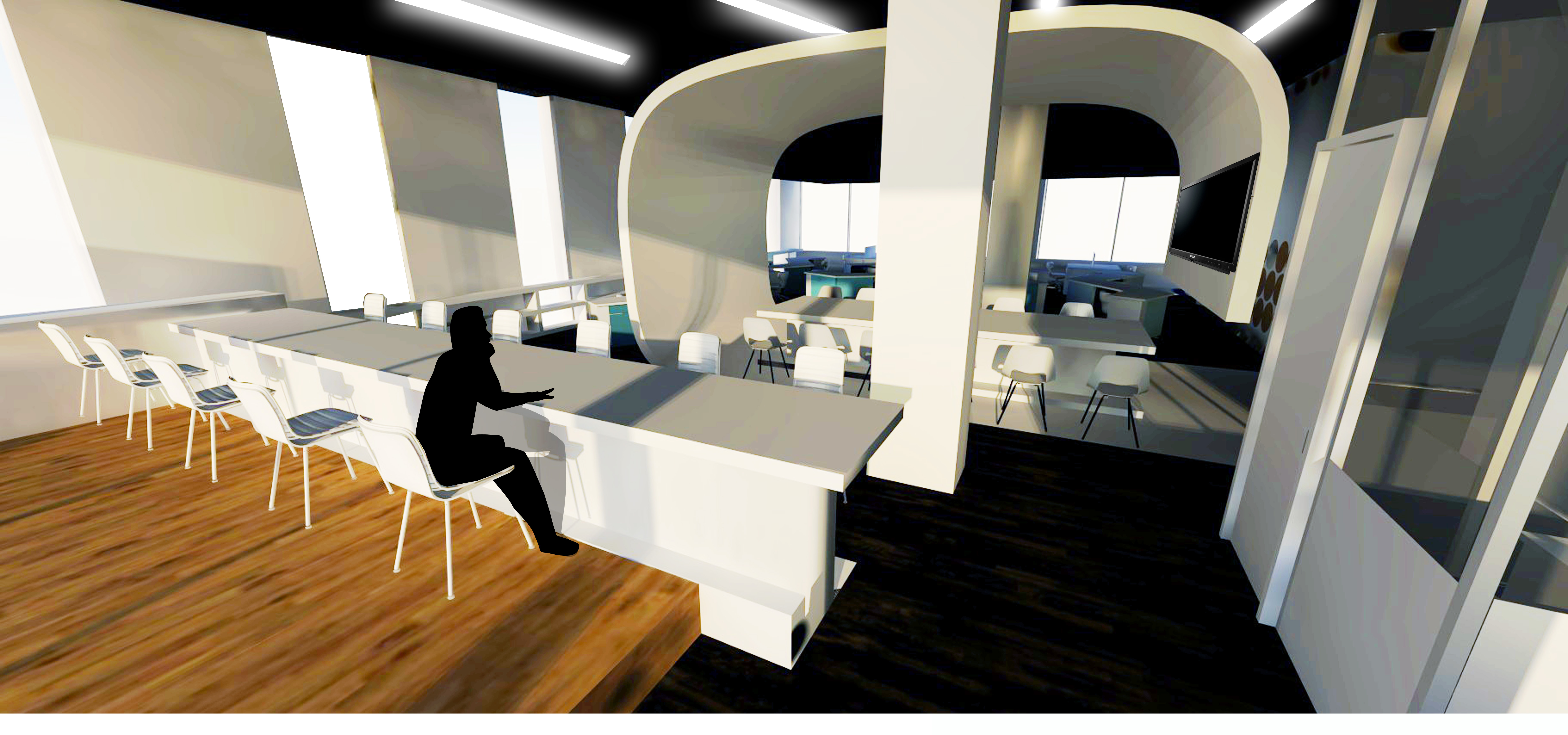
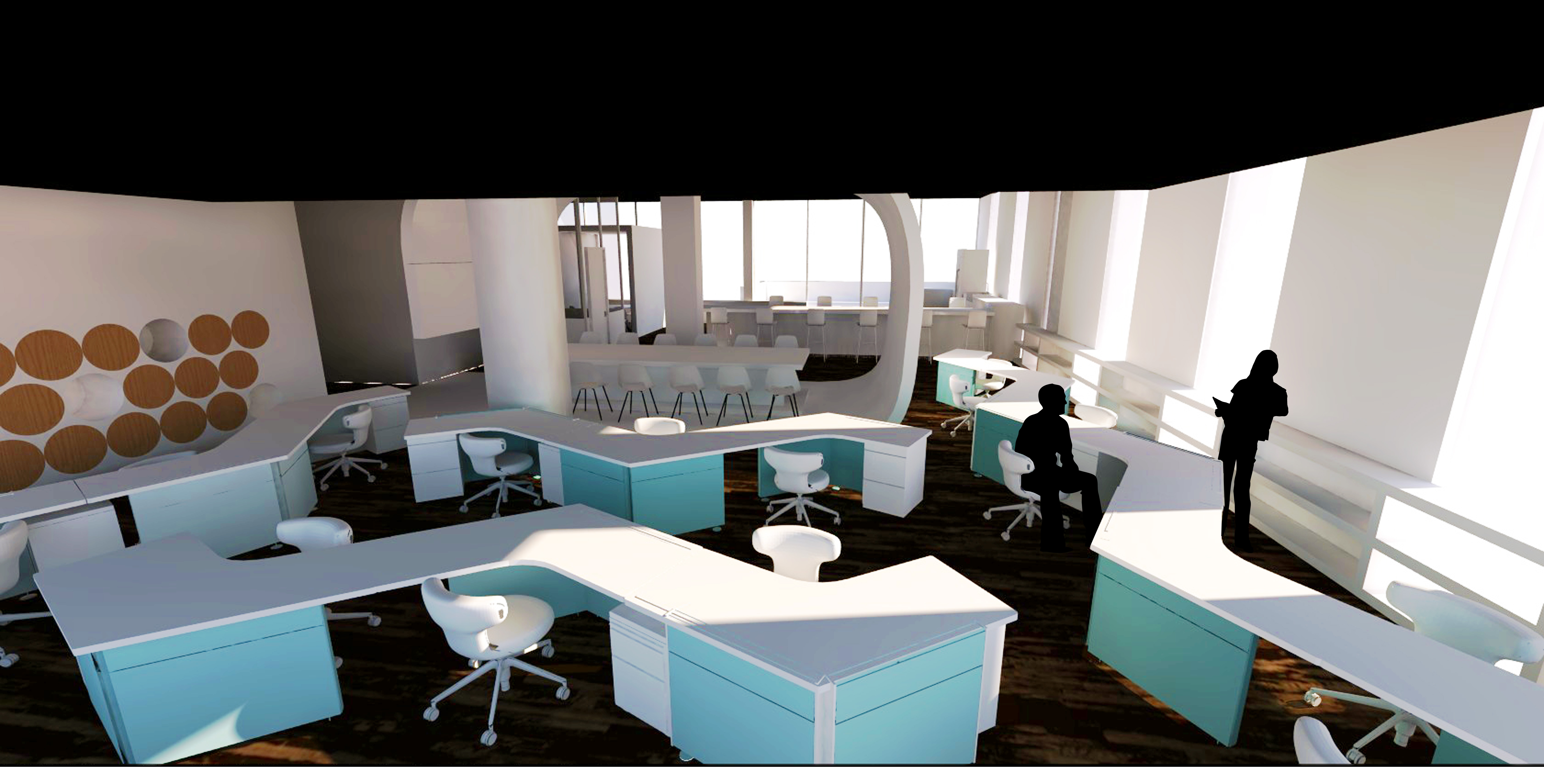
The challenge of the second office design was that we had to use systems furniture pieces to create a new desk system that had not been done before, and then implement it in the office design. I loved designing this office, especially the curve-form conference area that hugs the entrance and invites clients into the space, as well as separate the serious workspaces from the more casual environments of the café and collaborative areas.
Last summer, after my first year in school, I interned here at Turn Key, and had the most amazing experience, getting to see both the design side and the business side of the job. I got to research furniture and fabrics for different projects, place orders for products, and sit in on client meetings. It was the best experience, at the exact right time, and I definitely think it gave me an advantage going into my first real year of Interior Design. It’s given me a great experience with residential design, which not many of my classmates have had.
I had such a blast last summer that I’m back again part-time this summer, and I’m so excited to be back! Whether it’s filing fabric samples, designing graphics or researching products, every day at Turn Key has something new and exciting!
Through my experiences at Turn Key and in design school, I’ve come to realize that interior design is SO MUCH more than the HGTV portrayal of painting and pillow-fluffing. It not only takes an eye for style, but a knowledge of building systems, material properties, environmental factors, and human tendencies and interactions just to name a few!
Leave a commentA buzz from Bea Gates:
Many of you probably have tons of photos on your phone. I currently have 1,972. I have downloaded these photos onto my computer, but I’m not willing to remove them from my phone, because I reference them so often. These photos consist of client interiors, market pictures, trips, food, friends, design inspiration, fabrics, and the list goes on. Nature though, always seems to stand out. I find myself looking at the same photos over and over again. These are the ones that inspire me the most. The colors, textures, and subject matter from nature inspire everyday.

Flying across The Exumas. These colors are stunning. Deep turquoise and emerald green are the colors of the year in design and fashion.
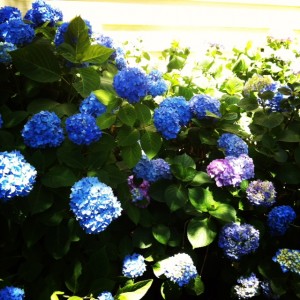
Hydrangeas in my garden certainly make me happy. The purples and deep blues go so well together.
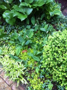
I love the variety of greens in this shaded garden. It’s lovely!

This incredible starfish was found while in the Bahamas. The texture and reflection are enchanting.

The deep chocolate color of this exquisite horse is the perfect shade of brown.

This tropical flower has such intense color. I want to use this color combination in an interior space.

Vibrant orange! Love it.

Beautiful shade of yellow.
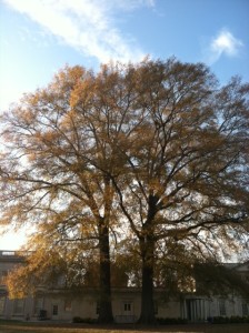
The subtle shade of gold in these most magnificent trees is divine. I’m drawn to the symmetry as well.

I could see the texture of these fish scales in a wall covering.

This non-filtered sunrise is breathtaking. Doesn’t get much better than this!
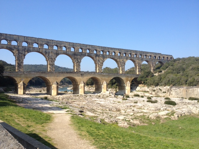
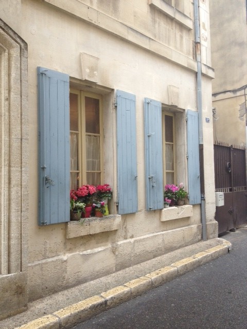
Leave a commentOn a recent trip to France, I was awestruck by the natural and architectural design that is such a part of daily life there. I know this beauty is everywhere but often we are just too busy or distracted to notice and appreciate it.
Our mantra this year at Turn Key Interiors is to SLOW DOWN and enjoy the process, knowing the result will be better for it in the end.
One of the reasons travel is so renewing, whether it is local or a bit afar, is because without the daily distractions of schedules, phones, and other interruptions of living our lives, we are able to actually stop and pay attention to the beauty that abounds. We are also on a slower pace that allows us to focus without distraction and take time to live that way, too.
Our hope in sharing this blog with you is to help us all pause and take notice of our surroundings and our world as we live in it daily. Asking ourselves: What can be better? What needs to be dropped by the wayside? What shall we spend more time on to get an ultimately better result? I recently told a friend that I don’t live to design, I design so I can get on with my living. I think this is true for all of us but I we must pause and enjoy the process, as well as be excited about the final result. . . remembering that, like the Roman Aqueduct in Nimes, form and function were not built in a day!
Welcome to our blog Gates and Moore as we pause along the way.
